Planning your wedding color palette is one of the most exciting parts of the journey—but it can also feel surprisingly overwhelming. Your colors set the tone, shape the mood, and most importantly, determine how your entire day looks on camera. Whether you’re dreaming of a soft, romantic vibe or bold, modern contrasts, choosing the right palette makes all the difference.
Let’s break down how to choose wedding colors that look absolutely stunning in photos, every single time.
Understand the Mood You Want to Create
Before picking specific shades, start by imagining the overall vibe you want your wedding to have. Your colors should support that mood from start to finish.
Ask yourself:
- Do you want a soft and romantic feeling?
- Do you prefer something bold and statement-making?
- Are you going for rustic, modern, vintage, coastal, or garden-inspired?
Visualizing your theme helps narrow down the type of colors that naturally complement it.
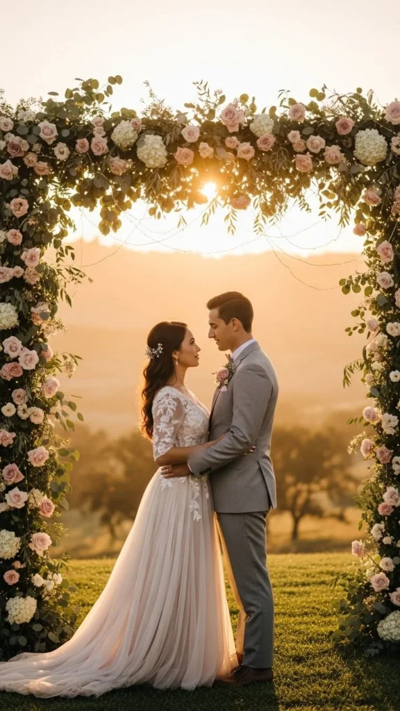
Consider Your Venue and Season
Your venue and chosen date play a huge role in how colors appear in photos. Lighting, architecture, and natural surroundings all affect how shades translate on camera.
Venue Tips
- Outdoor garden or beach venues: Light, breezy colors like lavender, champagne, and sky blue photograph beautifully.
- Indoor industrial spaces: Deep jewel tones or warm neutrals add depth against metal or exposed brick.
- Ballrooms and traditional venues: Classic palettes like ivory, gold, navy, or black tie always shine.
Seasonal Tips
- Spring: Blush, lilac, buttercream, and fresh greens.
- Summer: Vibrant corals, warm pinks, citrus tones, and nautical blues.
- Fall: Terracotta, burgundy, mustard, forest green.
- Winter: Emerald, plum, ivory, and icy blue.
Your photographer will thank you for choosing colors that elevate the natural setting rather than fight against it.
Think About How Colors Photograph
Some colors behave beautifully on camera, while others are trickier. Understanding how they translate in photos helps you avoid surprises on your wedding day.
Colors That Photograph Well
- Soft neutrals (ivory, taupe, champagne)
- Dusty pastels (mauve, sage, dusty blue)
- Rich jewel tones (emerald, burgundy, amethyst)
- Elegant classics (navy, black accents, gold)
These shades tend to maintain their depth and tone regardless of lighting conditions.
Colors to Use Carefully
- Very bright neons (can overpower skin tones)
- Dark browns or deep reds (may look muddy in low light)
- Pure white for bridesmaid dresses (can compete with the wedding dress)
If you’re unsure, ask your photographer—they often have great insight from shooting at your venue.
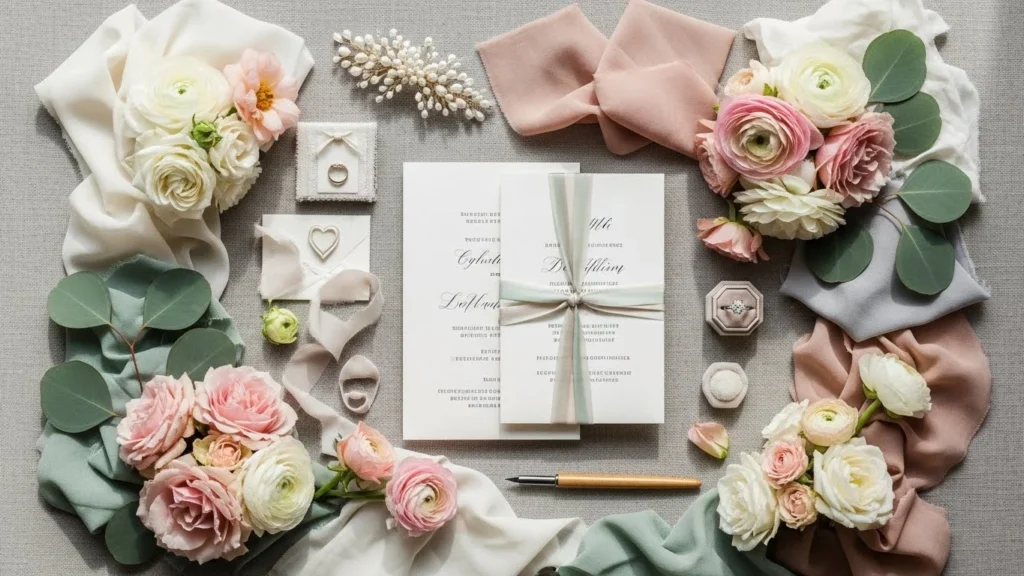
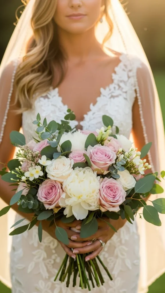
Build a Cohesive Palette (3–5 Colors Work Best)
Instead of choosing a single shade, create a palette of harmonizing colors. This gives your photographer more to work with and adds depth to every photo—from bouquets to table décor.
How to build your palette:
- Start with one anchor color. This is your main vibe-setter.
- Add one or two complementary tones. These support your anchor.
- Finish with a neutral. Ivory, taupe, gray, or metallics tie everything together.
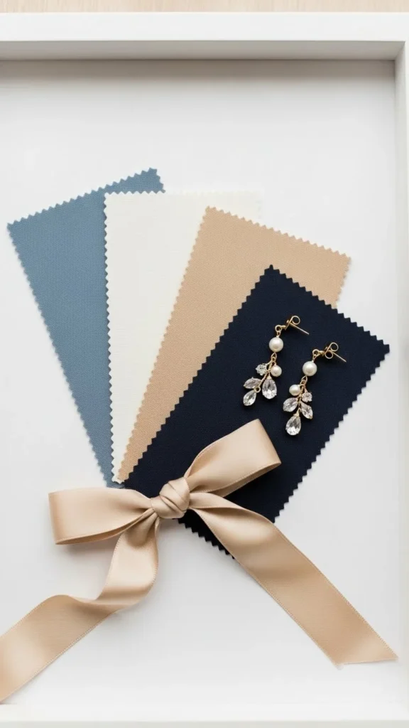
If you want your palette to feel even more dynamic, mix in different textures like velvet, chiffon, matte ceramics, or metallic accents.
Keep Skin Tones and Attire in Mind
Your wedding party will be photographed a lot, so make sure your color choices flatter everyone and photograph well on fabric.
Helpful tips:
- Offer 2–3 dress shade options within your palette so bridesmaids can choose what flatters them.
- Be mindful of undertones—cool colors often pair better with cooler complexions, and vice versa.
- For the groom and groomsmen, suits in navy, charcoal, or soft tan tend to pair beautifully with most wedding colors.
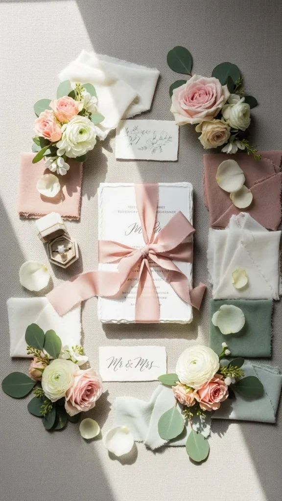
Test Your Palette in Real Lighting
Before finalizing your colors, do a quick “camera test.” This is one of the most underrated steps—and one of the most helpful.
How to test:
- Gather fabric swatches, flowers, and décor items.
- Place them near a window or outside in natural light.
- Take photos on your phone and see how everything looks.
If anything feels off or overly bright, adjust your palette until it looks seamless.
You’ll be surprised how much lighting influences your final decision!
Use Color Strategically Throughout the Day
The key to getting beautiful photos is consistency. Make sure your chosen palette appears in all the right places—not just the bridesmaid dresses.
Use color in:
- Bouquets and boutonnières
- Ceremony backdrops
- Table linens and florals
- Stationery
- Cake details
- Getting-ready robes or accessories
This repetition creates visual harmony in your photos from beginning to end.
Final Takeaway
Choosing wedding colors isn’t just about picking pretty shades—it’s about creating a palette that photographs beautifully and tells your unique love story. With a little planning, venue awareness, and color testing, you’ll end up with photos you’ll adore for a lifetime.
Save this guide for later, and start building your dream palette today! 💍✨