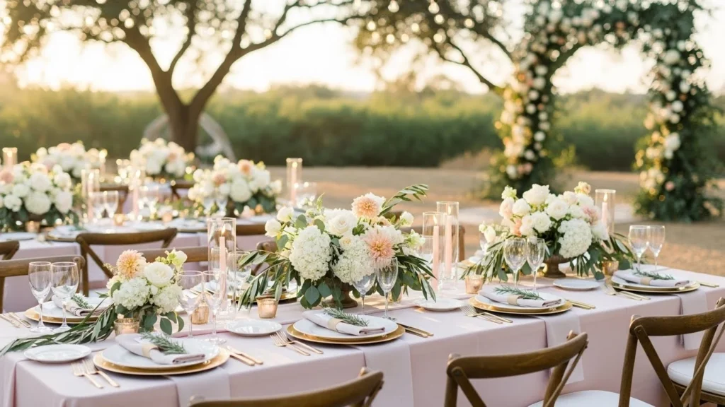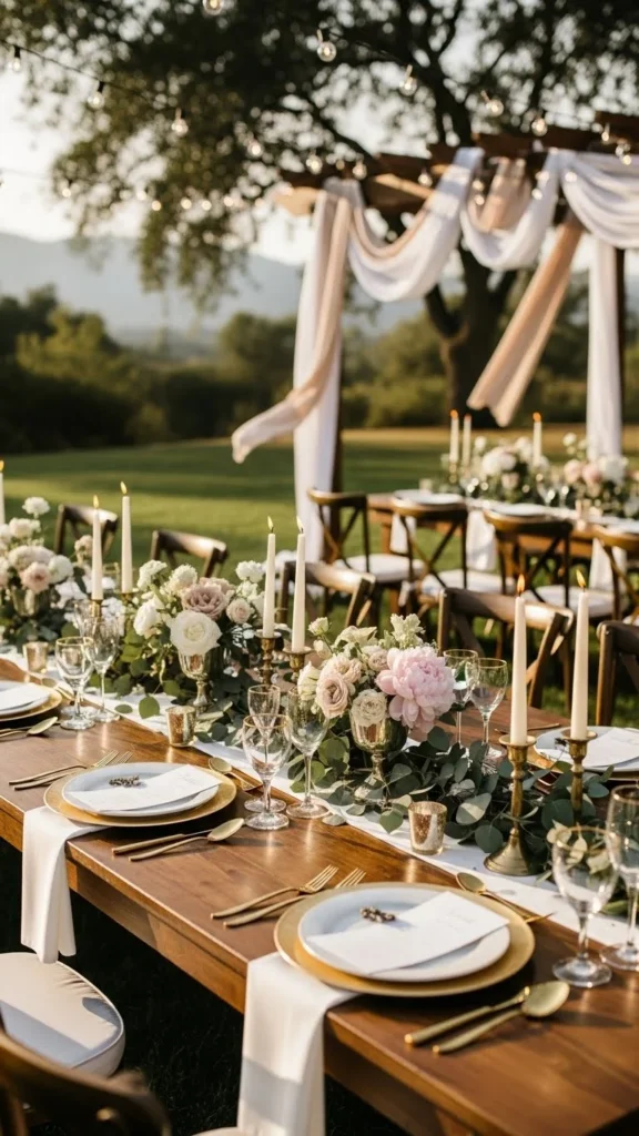
Planning wedding colors can feel simple when you see them styled in real settings. The right palette shapes the mood, simplifies décor decisions, and helps every detail feel connected. Below are 24 easy-to-use color ideas with practical tips you can apply on any budget. Each one includes simple swaps, DIY tricks, and realistic adjustments so you can create a polished look without fuss.
1. Soft Blush, Cream, and Warm Taupe
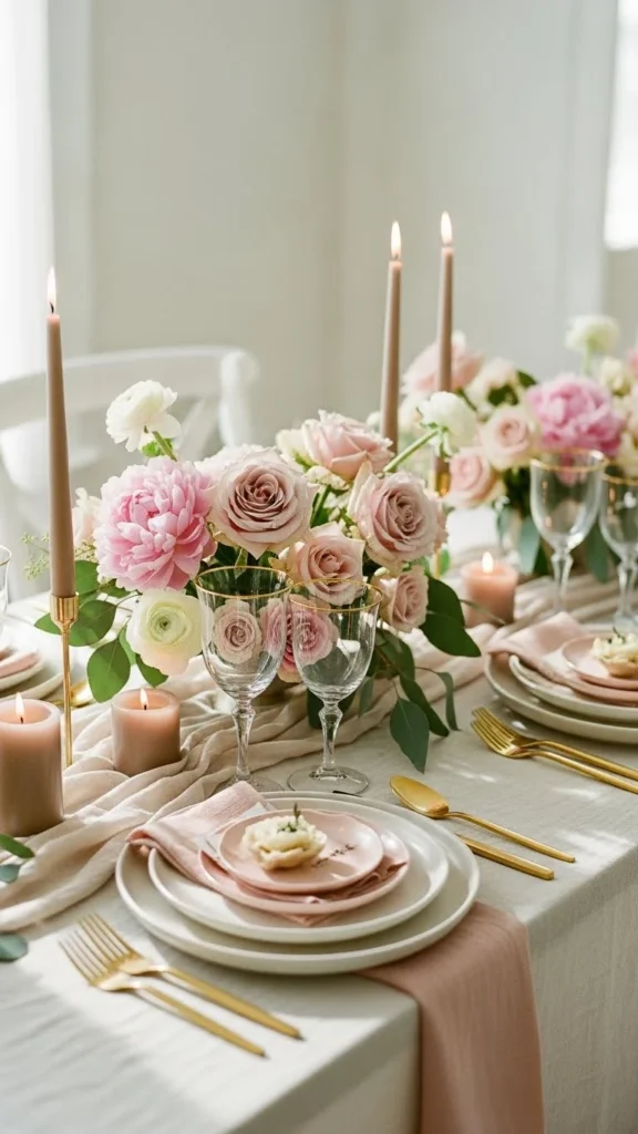
Soft blush paired with cream and warm taupe works well for couples who want a gentle, calm atmosphere. These colors look great in spring and work with many venues. Keep the palette simple by choosing blush flowers, cream linens, and taupe candle holders.
Break up the tones with natural textures like wood chargers or woven placemats. These small changes stop the look from feeling flat.
Go budget-friendly by mixing real and faux flowers. Faux stems in blush shades photograph beautifully and help you save. Add cream taper candles for height and warmth.
For DIY décor, paint thrifted vases in soft taupe chalk paint. It dries fast and gives a smooth, clay-like finish.
Use ribbon scraps to tie napkins or wrap bouquets. These small pops of blush help pull everything together.
This palette also works for attire. Dresses in soft blush and suits in warm taupe create a clean contrast without feeling heavy.
2. Sage Green, Ivory, and Gold
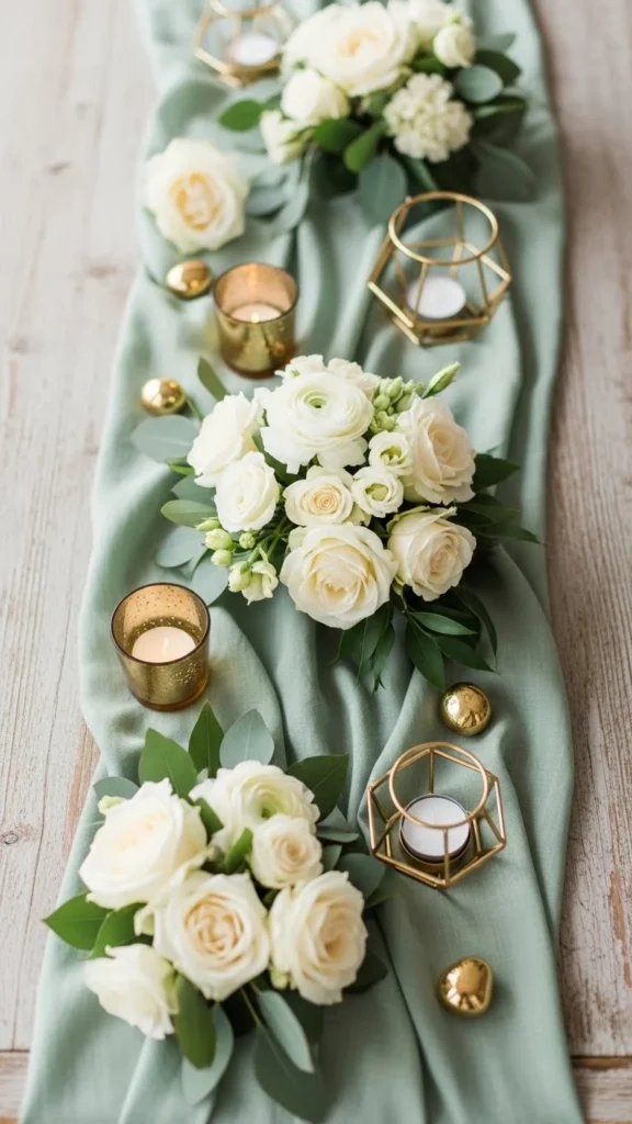
Sage, ivory, and gold feel calm and airy. This palette works indoors or outdoors, especially in garden settings. Start with sage table runners, ivory florals, and gold accents like flatware or candle holders.
Create interest with soft draping or simple greenery garlands. Keep pieces light and spaced out so the palette stays soft.
Save money by renting gold flatware instead of buying it. If rentals aren’t available, spray-paint thrifted candlesticks gold for a similar effect.
For DIY stationery, print ivory paper at home and add sage watercolor touches around the edges. It doesn’t need to be perfect; the organic look adds charm.
For bouquets, layer sage-toned eucalyptus with ivory roses. This combination gives structure without adding cost.
If you want pops of color, choose muted peaches or beige tones so the palette still feels grounded.
3. Dusty Blue, White, and Silver
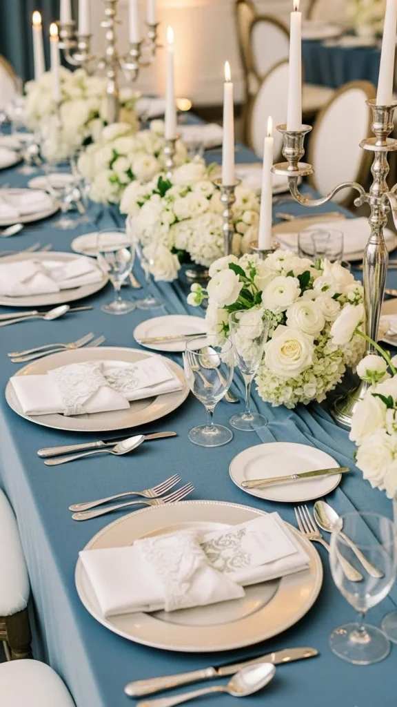
Dusty blue brings a calm, cool atmosphere that works well in any season. Pair it with crisp white and clean silver pieces for a tidy, airy layout.
Use dusty blue napkins, white hydrangeas, and silver chargers to build the foundation. Keep shapes simple so the colors stand out.
Create easy DIY candle clusters using clear glass holders. The clear glass helps the palette stay open and not too heavy.
If you want décor that feels custom, dye cheesecloth in dusty blue using fabric dye or even natural dyes like blueberries. It creates a soft, textured runner without spending much.
Bridesmaids can wear dusty blue while groomsmen use light gray ties to keep the cool tones consistent.
Add small pops of white ribbon on chairs or bouquet stems. It pulls every detail together without crowding the space.
4. Terracotta, Cream, and Mustard
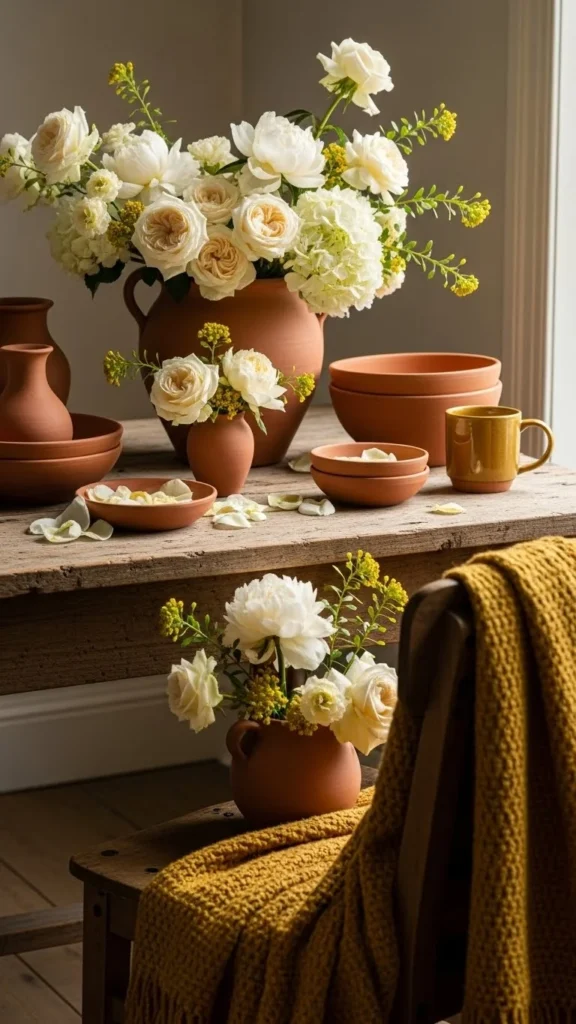
Terracotta fits beautifully with outdoor or barn celebrations. When mixed with cream and mustard, it becomes warm and grounded without feeling heavy.
Use terracotta pots, cream roses, and mustard textiles to shape the look. You can find terracotta items at hardware stores for a low price.
Paint some of the pots in lighter tones for variety. The mixed finishes add depth.
For DIY décor, fill pots with dried flowers like bunny tails, strawflowers, or pampas. They last long and cost less than fresh blooms.
Use simple cream candles to brighten the table. Add mustard napkins or ribbons for contrast.
If you want a softer touch, add beige and clay tones. They blend naturally with terracotta without shifting the palette too much.
5. Burgundy, Champagne, and Soft Pink
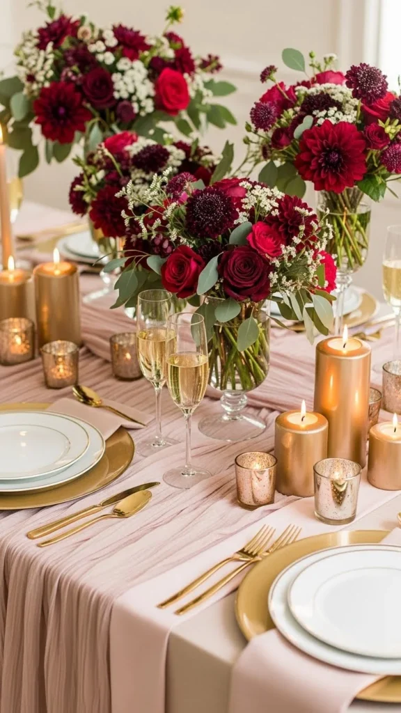
Burgundy creates a rich backdrop, and the champagne tones lighten everything. Soft pink adds a romantic touch.
Start with burgundy flowers, champagne linens, and soft pink napkins. These three pieces alone set a beautiful foundation.
Save money by choosing in-season burgundy blooms like dahlias or carnations. They look lush without stretching your budget.
DIY centerpieces can include gold or champagne-painted bottles as vases. Add soft pink single stems for a gentle contrast.
Use ribbon in champagne and pink around bouquets or chairbacks. Small ribbons bring the entire palette together.
This trio also works well for fall weddings, especially when paired with candlelight. It feels warm but not too dark.
6. Mauve, Dove Gray, and White
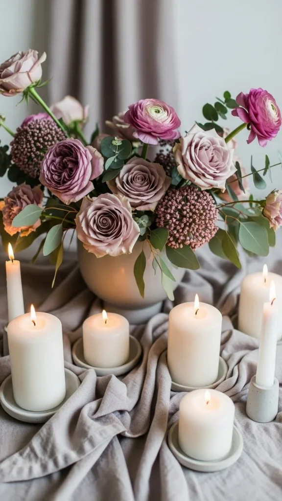
Mauve and dove gray create a calm, elegant combination. White keeps the palette open and airy.
Start with mauve centerpieces, gray tablecloths, and white taper candles. These pieces mix well with nearly any venue.
To save money, use gray table runners instead of full linens. Runners cost less and still deliver the look.
DIY gray-painted vases can help tie the tones together. Add mauve flowers or dried blooms for texture.
For stationery, print on white cardstock and add a small mauve border using markers or watercolor. It looks custom with very little cost.
Bridal parties can mix-and-match mauve and gray outfits. This keeps the palette interesting without strict matching.
7. Navy, Copper, and Cream
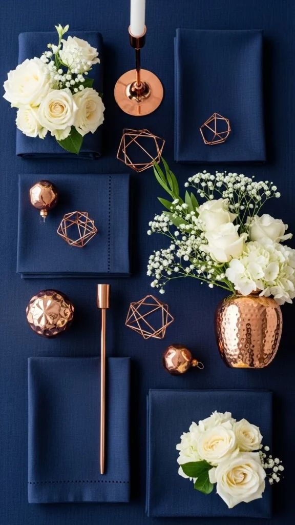
Navy adds a strong base while copper creates warmth. Cream gives the palette softness so it stays balanced.
Use navy runners, copper candle holders, and cream flowers. These three items instantly shape the atmosphere.
Find copper pieces at thrift stores. Even mismatched items work well when grouped.
DIY copper-painted frames make great table numbers. Just insert simple cream paper and navy writing.
For bouquets, mix cream roses with navy ribbons. The contrast photographs beautifully.
If you want more texture, add wood accents. The brown tones blend naturally with copper without altering the palette.
8. Peach, White, and Soft Green
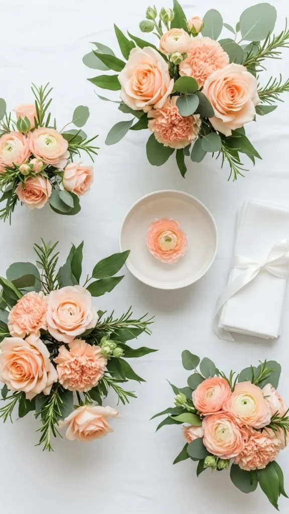
Peach and white create a gentle look that works nicely in spring and summer. Soft green adds freshness.
Start with peach bouquets, white linens, and greenery runners. Keep everything light to match the airy feel.
Save money by using lots of greenery. Eucalyptus and ruscus are great choices and fill space well.
DIY peach-painted vases or jars can add color without overwhelming the table. Add white single stems for a clean finish.
For place settings, tie green ribbon around white napkins. The small accent keeps the palette consistent.
Bridesmaids can wear peach dresses or mix soft green tones for variation.
9. Olive Green, Beige, and White
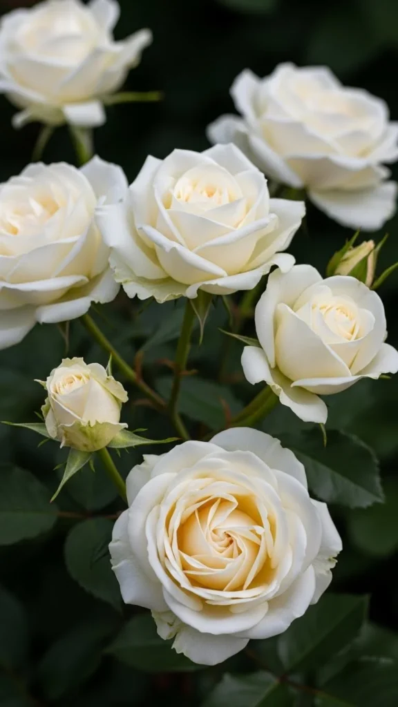
Olive green brings an earthy, grounded feel. Beige makes everything warm, and white keeps the look bright.
Use olive table runners, beige napkins, and white flowers. These three elements give a natural, effortless look.
DIY beige candle holders using air-dry clay are simple and affordable. Shape them loosely for a rustic finish.
For florals, rely on greenery-heavy arrangements to keep costs low. Add white roses or daisies for softness.
Tie olive green ribbons around menus or table numbers. It matches the tone without adding clutter.
This palette pairs well with wood tables or outdoor venues.
10. Lavender, Soft Blue, and White
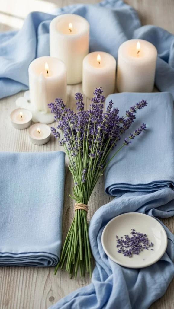
Lavender and soft blue create a dreamy look that feels calm and light. White adds clarity so the palette stays clean.
Build the base with lavender bouquets, soft blue napkins, and white candles.
Use DIY lavender sachets as favors. They smell great and look charming on tables.
Mix real and faux lavender stems to save money. Faux stems blend well when layered in vases.
For stationery, print on white paper and use soft blue envelope liners. It feels thoughtful without extra cost.
This palette works well in gardens or waterfront spaces where cool tones naturally shine.
11. Emerald, Black, and White
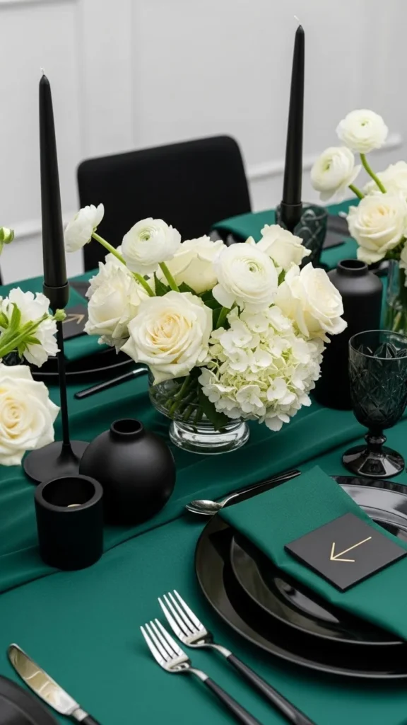
Emerald with black creates a clean, modern style. White lightens the palette so it doesn’t feel too heavy.
Start with emerald table runners, black candle holders, and white roses.
DIY black-painted bottles make great vases. Add emerald ribbon around the neck for a simple detail.
For place cards, print on white cardstock and add a small emerald brushstroke using craft paint.
This palette works well in modern venues or spaces with strong architectural details.
Bridal parties can wear emerald gowns or black suits with emerald ties.
12. Champagne, White, and Beige
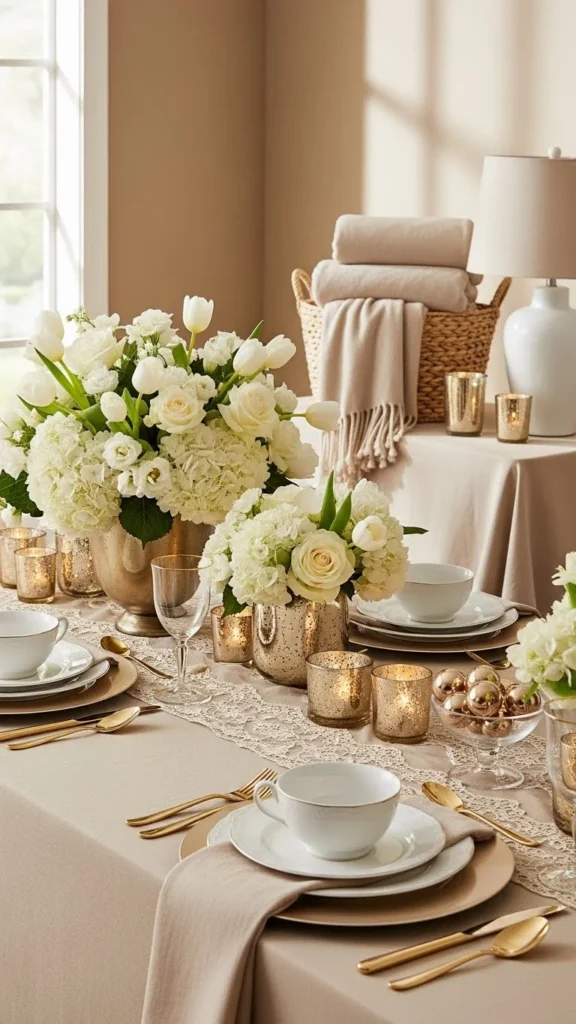
Champagne and beige offer a warm, neutral look. White keeps the palette bright and clean.
Use champagne vases, white flowers, and beige napkins to set the tone.
Save money by using neutral candles in mixed heights. They add interest without needing extra décor.
DIY beige table numbers using kraft paper are simple and stylish. Add white ink for contrast.
For florals, choose full blooms like hydrangeas to fill space.
This palette works nicely for couples who want something soft and simple.
13. Coral, Turquoise, and White
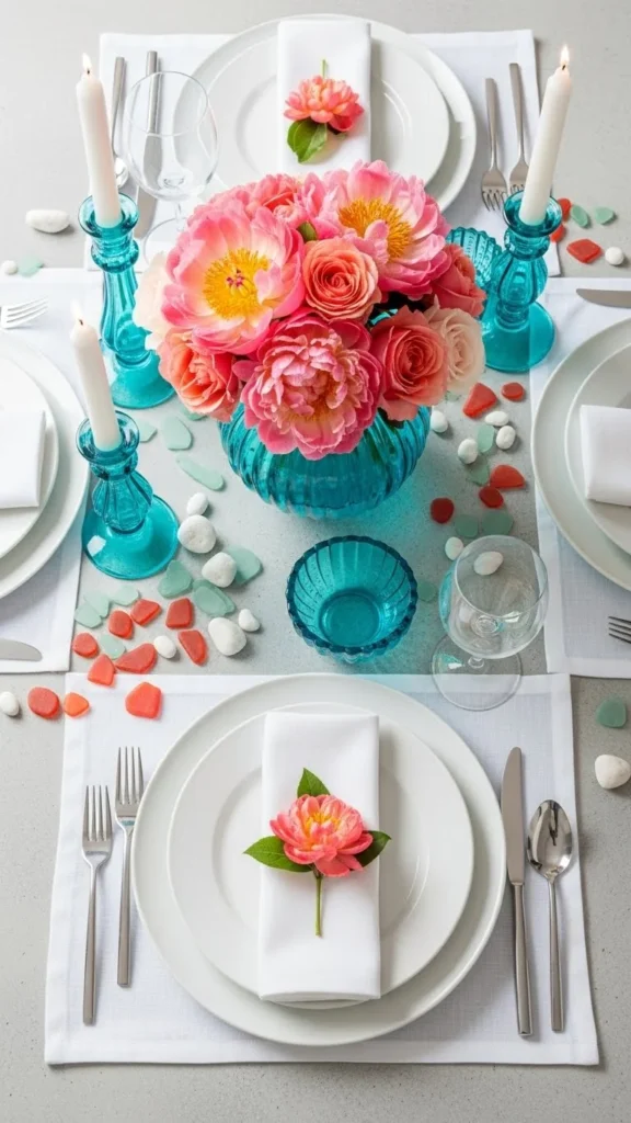
Coral and turquoise bring a lively yet balanced look. White keeps everything bright.
Start with coral flowers, turquoise glassware, and white linens.
Reuse turquoise bottles or jars as vases. They add color without much effort.
For DIY décor, paint wooden signs in coral tones. Add simple white lettering for a clean finish.
Bridesmaids can mix coral and turquoise accessories to spread the palette naturally.
This combo works nicely for beach or summer celebrations.
14. Mocha, Ivory, and Dusty Rose
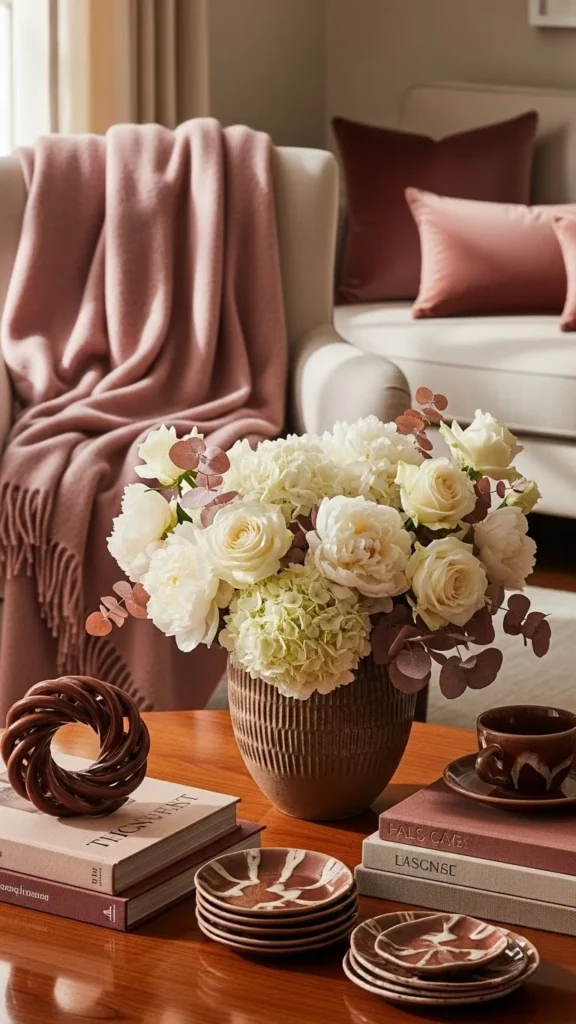
Mocha feels warm and grounded. Ivory brightens the palette while dusty rose adds a soft, romantic layer.
Use mocha candles, ivory flowers, and dusty rose napkins.
DIY dusty rose table runners using dyed cheesecloth keep the palette consistent at a low cost.
For bouquets, mix ivory blooms with mocha-toned dried pieces like palm spears.
Use small dusty rose ribbons on menus or favors.
This palette works beautifully in rustic or classic venues.
15. Plum, Gold, and Cream
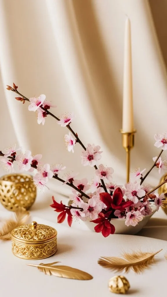
Plum brings depth, gold adds warmth, and cream softens everything.
Start with plum centerpieces, gold candle holders, and cream linens.
DIY plum-painted vases or jars add color affordably.
Use cream candles in mixed heights for quick visual interest.
For stationery, pair cream cardstock with gold edges.
This palette suits fall or evening celebrations where warm lighting helps the colors shine.
16. Coral, Blush, and Ivory
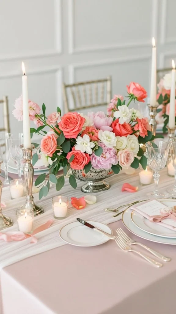
Coral feels lively, while blush softens the tone. Ivory keeps the balance clean.
Use coral bouquets, blush napkins, and ivory tablecloths.
DIY blush-painted jars work well as vases.
To save costs, mix coral and blush single stems in small clusters instead of full arrangements.
Use ivory ribbons on chairs or favors.
This palette fits spring and summer celebrations and photographs beautifully in natural light.
17. Forest Green, White, and Wood Tones
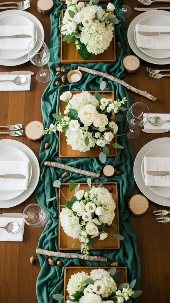
Forest green and wood tones create a grounded look. White brightens the combination.
Start with forest green runners, white flowers, and wood chargers.
DIY wood table numbers using small slices or blocks are easy and inexpensive.
Use greenery-heavy arrangements to save money.
For stationery, print on white paper and add green leaves or stamps.
This palette suits barns, forests, or outdoor patios.
18. Rust, Beige, and Cream
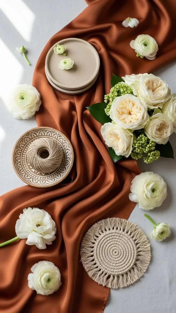
Rust offers warmth and character. Beige and cream soften the strong tone.
Use rust napkins, beige runners, and cream roses.
DIY rust-painted pots or vases give the palette structure.
For bouquets, mix cream blooms with rust ribbons.
Use beige pillar candles for height.
This palette works beautifully in fall and pairs well with outdoor settings.
19. Black, White, and Soft Gold
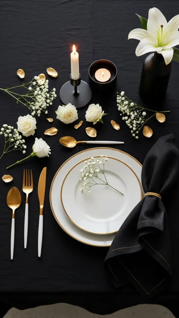
Black and white create a clean backdrop. Soft gold adds warmth so the palette doesn’t feel stark.
Use black chargers, white flowers, and gold utensils.
DIY black-painted frames or bottles can add structure at no extra cost.
For stationery, keep it white with small gold corners.
Add white candles to balance the darker tones.
This palette suits modern and minimalist spaces.
20. Maroon, Dusty Blue, and Cream
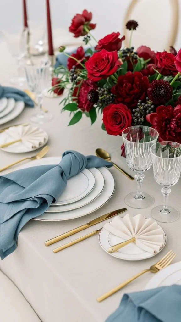
Maroon adds richness. Dusty blue softens the palette, and cream ties everything together.
Use maroon bouquets, dusty blue napkins, and cream linens.
DIY dusty blue candle holders using chalk paint keep costs low.
Mix maroon and blue ribbons on chair décor.
For bouquets, add cream filler flowers to brighten the deeper tones.
This palette works well in cool-weather celebrations.
21. Mustard, Navy, and White
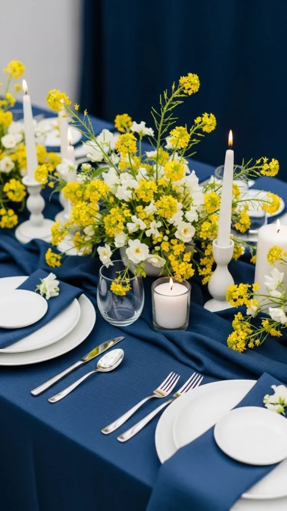
Mustard and navy feel bold but still balanced. White breaks up the stronger tones.
Use mustard flowers, navy napkins, and white candles.
DIY mustard-painted vases give the palette personality.
Use navy ribbons on signage or favors.
For table settings, choose white plates with navy chargers.
This palette suits fall or modern venues.
22. Charcoal, Blush, and Ivory
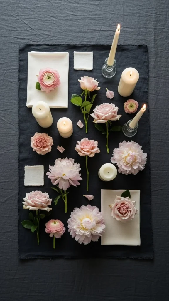
Charcoal offers a strong base. Blush lightens the palette, and ivory keeps it airy.
Use charcoal tablecloths, blush bouquets, and ivory taper candles.
DIY blush-painted jars are simple and affordable.
For stationery, use ivory paper with charcoal lettering.
Blush ribbons on napkins tie everything together.
This palette works well for indoor spaces or evening events.
23. Warm Gray, Sage, and White
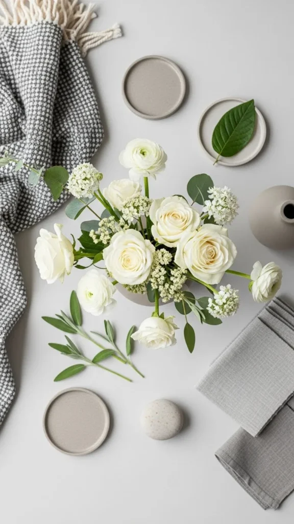
Warm gray and sage feel soft and calming. White brightens the mix.
Start with warm gray napkins, sage runners, and white flowers.
Use DIY sage-painted vases or candle holders for quick color.
For bouquets, blend white roses with sage greenery.
Add warm gray ribbons on menus or chair décor.
This palette suits cozy venues or outdoor gardens.
24. Rose Gold, Blush, and Ivory
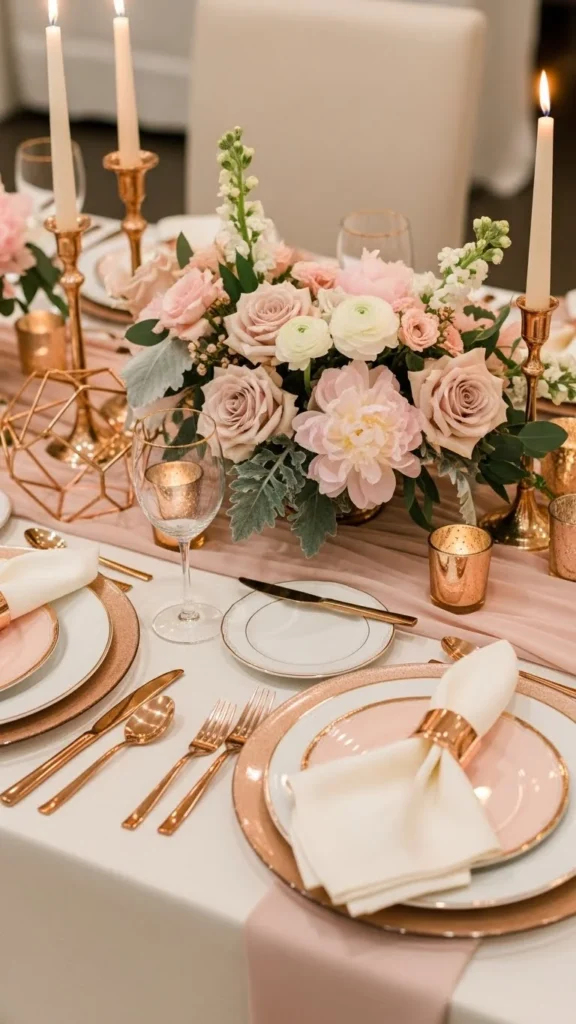
Rose gold pairs well with blush, creating a sweet and warm atmosphere. Ivory keeps the palette soft.
Use rose gold candle holders, blush flowers, and ivory tablecloths.
DIY rose gold-painted frames add sparkle without much cost.
For bouquets, tie blush ribbons around ivory blooms.
Add small rose gold accents like charger plates or flatware if available.
This palette fits spring, summer, and indoor celebrations with gentle lighting.
Conclusion
Color choices shape the feeling of your entire celebration. When you pick a palette you love, every detail becomes easier to coordinate—from flowers to attire to table décor. Use these palettes as starting points and adjust them to match your venue, season, and budget. A few simple DIY touches can help everything look connected without overspending. Have fun mixing textures, small accents, and natural elements until your day feels just right.
