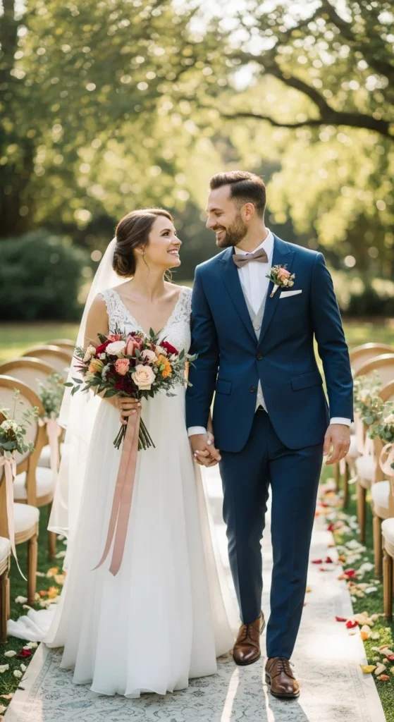
Spring wedding photos live on long after the day itself. Color plays a big role in how those photos feel over time. The right palette works with natural light, skin tones, and outdoor settings instead of fighting them. Many couples want colors that feel romantic but not loud, polished but still relaxed. These palettes focus on shades that photograph well, work across décor and attire, and stay manageable on a real budget. Each idea includes simple ways to bring the colors into your day without overbuying or overthinking.
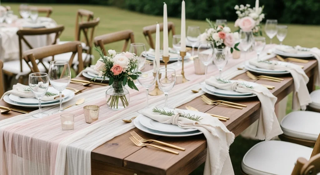
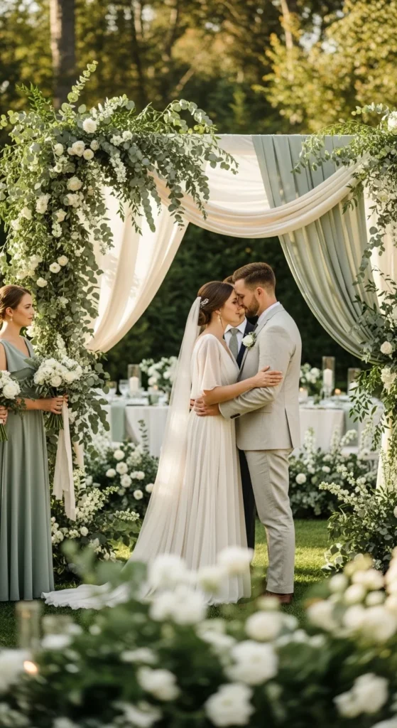
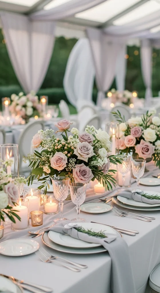
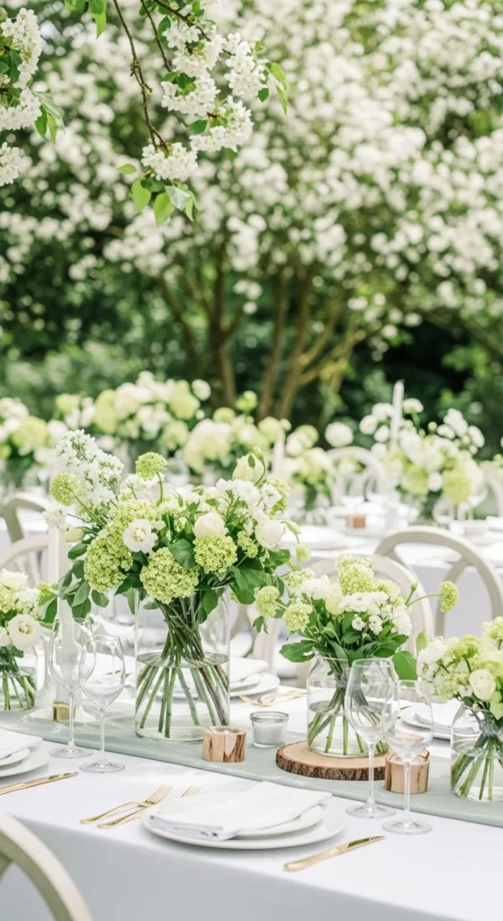
1. Blush and Soft Gray
Blush and gray create a calm, flattering look in photos. Blush warms the scene. Gray keeps it grounded. This palette works indoors and outdoors. Use gray linens or suits to anchor the look. Add blush through florals, napkins, or ribbons. For budget-friendly décor, focus on one blush floral per table mixed with greenery. Bridesmaid dresses in blush photograph softly in daylight. Gray paper goods save on printing costs and hide ink variations. This combo also works well for mixed-metal accents like silver and brushed gold.
2. Sage Green and Cream
Sage green feels natural and calm. Cream softens it in photos. This palette pairs well with wood, linen, and stone. Use sage through greenery-heavy arrangements instead of pricey blooms. Cream tablecloths reflect light and keep spaces bright. DIY signs on cream cardstock look clean and simple. Groomsmen ties or pocket squares in sage tie everything together without standing out too much.
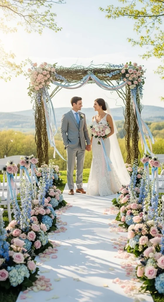
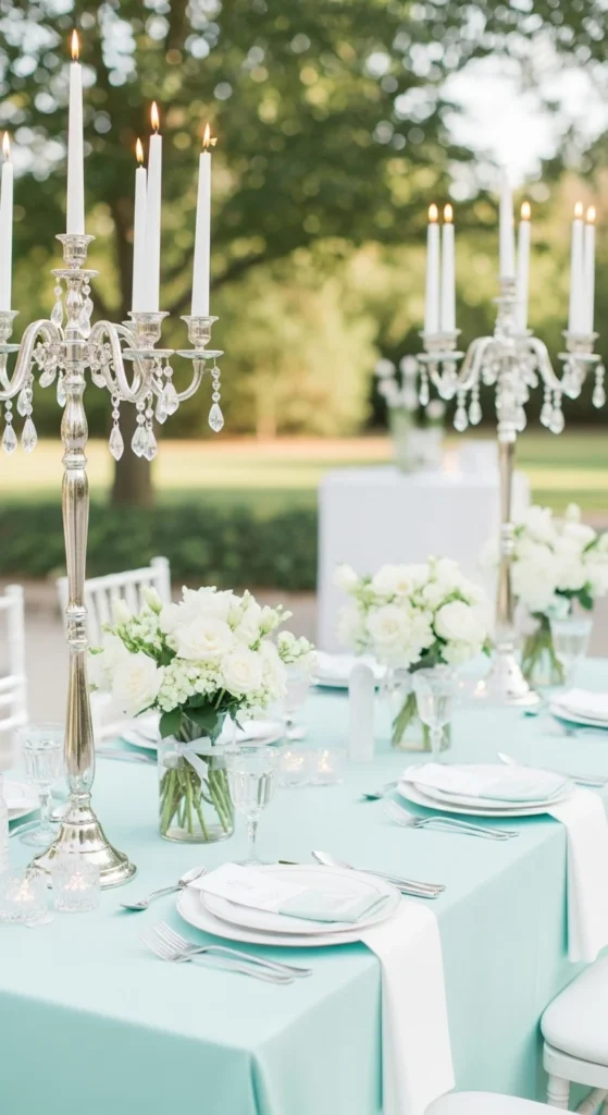
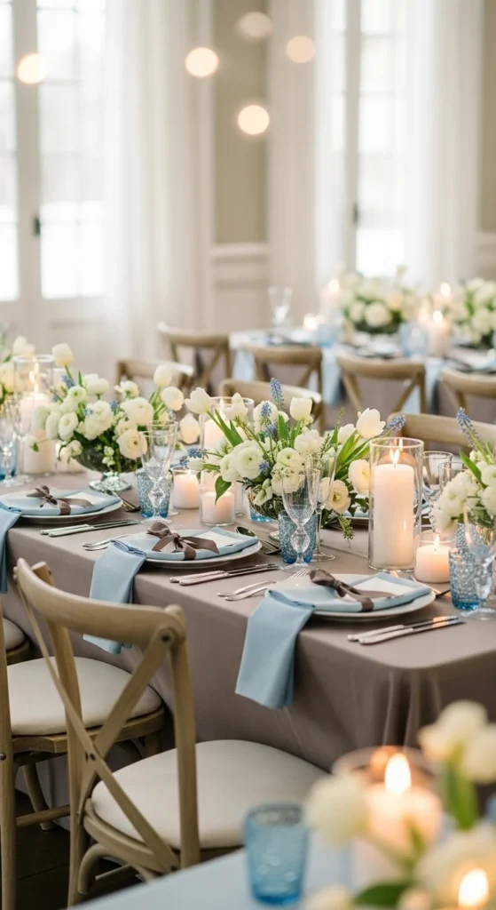
3. Dusty Blue and White
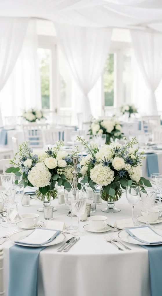
Dusty blue reads soft on camera. White keeps it classic. This palette works well near water or open skies. Use blue for table runners or napkins. Keep florals mostly white with hints of blue. Renting blue linens often costs the same as white. This palette looks great with clear glass and silver accents.
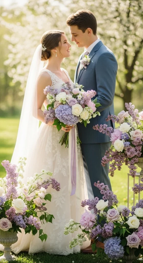
4. Lavender and Pale Gray
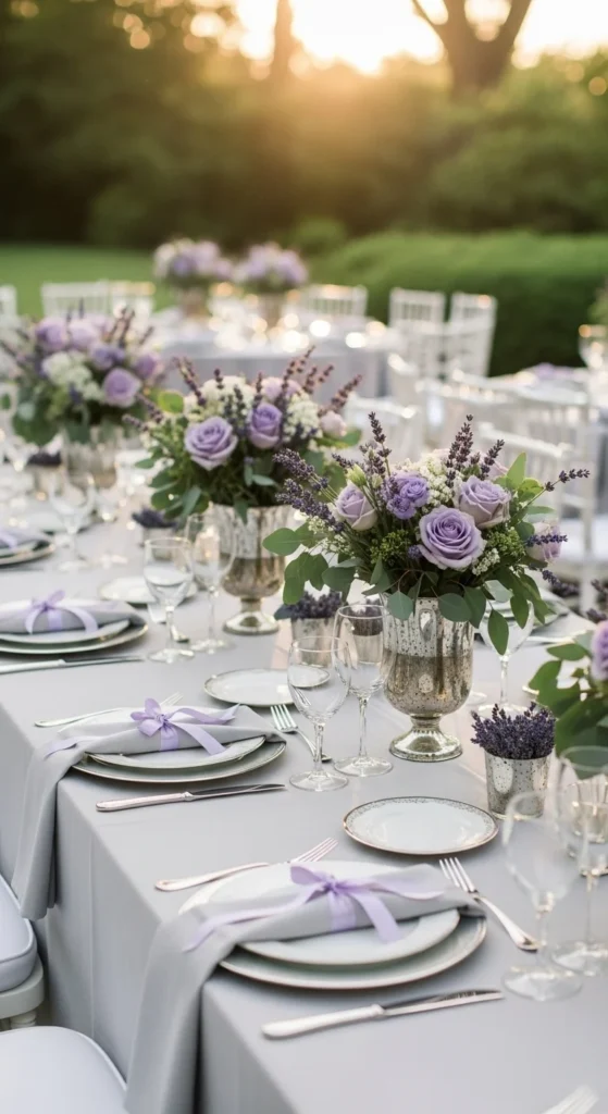
Lavender adds gentle color without overpowering photos. Pale gray keeps it calm. Use lavender sparingly in florals or stationery. Dried lavender works well and saves money. Gray suits photograph nicely against outdoor greens. This palette feels romantic without leaning too sweet.
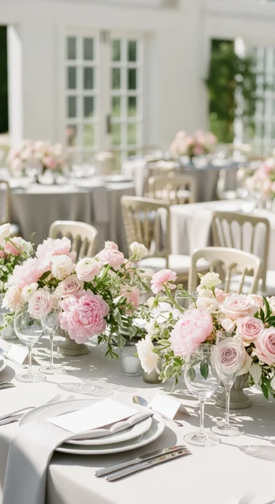
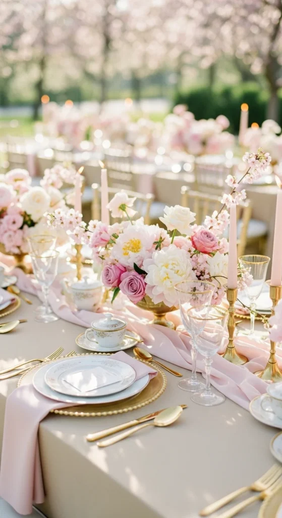
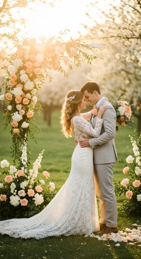
5. Peach and Soft Green
Peach brings warmth. Soft green balances it. This combo works well for garden venues. Use peach roses or ranunculus mixed with greenery. Keep linens neutral so colors don’t overwhelm photos. Peach paper goods photograph better than bright coral and stay flattering in sunlight.
6. Butter Yellow and Ivory
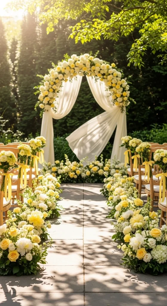
Butter yellow feels cheerful without being loud. Ivory tones it down. This palette shines in outdoor photos. Use yellow in small touches like napkins or florals. Ivory dresses and linens keep everything soft. DIY centerpieces with grocery store flowers work well here.
7. Mauve and Taupe
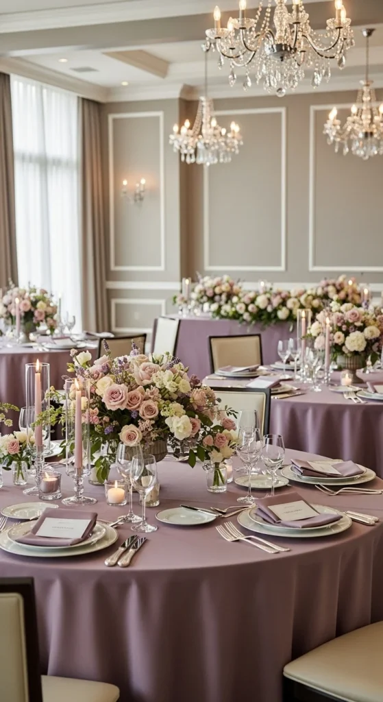
Mauve flatters many skin tones. Taupe adds depth. This palette feels polished in photos. Use mauve for attire or florals. Taupe linens or signage ground the look. This combo works well for indoor venues with softer lighting.
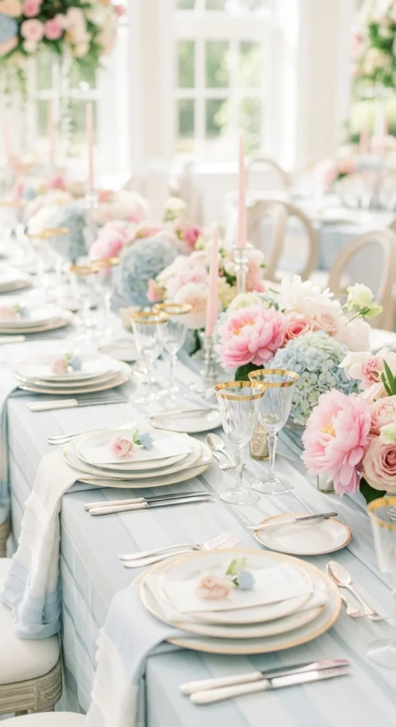
8. Sky Blue and Blush
Sky blue feels open and airy. Blush adds warmth. Use blue in linens or suits. Blush works well in bouquets. Keep décor light to avoid busy photos. This palette shines under clear skies.
9. Soft Coral and Sand
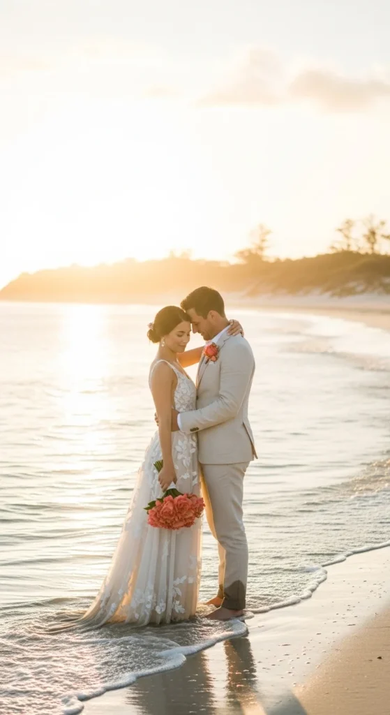
Soft coral reads warm without overpowering. Sand tones keep it neutral. This palette works well for beach or outdoor venues. Use coral in florals or stationery. Sand-colored linens reduce glare in photos.
10. Mint and White
Mint adds color while staying gentle. White keeps photos crisp. Use mint for napkins, ties, or signage accents. Keep florals mostly white. This palette works well with lots of natural light.
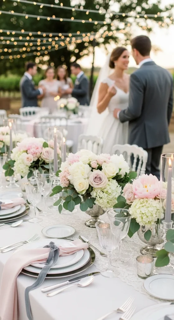
11. Champagne and Soft Pink
Champagne reflects light beautifully. Soft pink adds romance. Use champagne linens or chargers. Pink works best in florals. Metallic accents photograph well here without stealing focus.
12. Eucalyptus Green and Linen
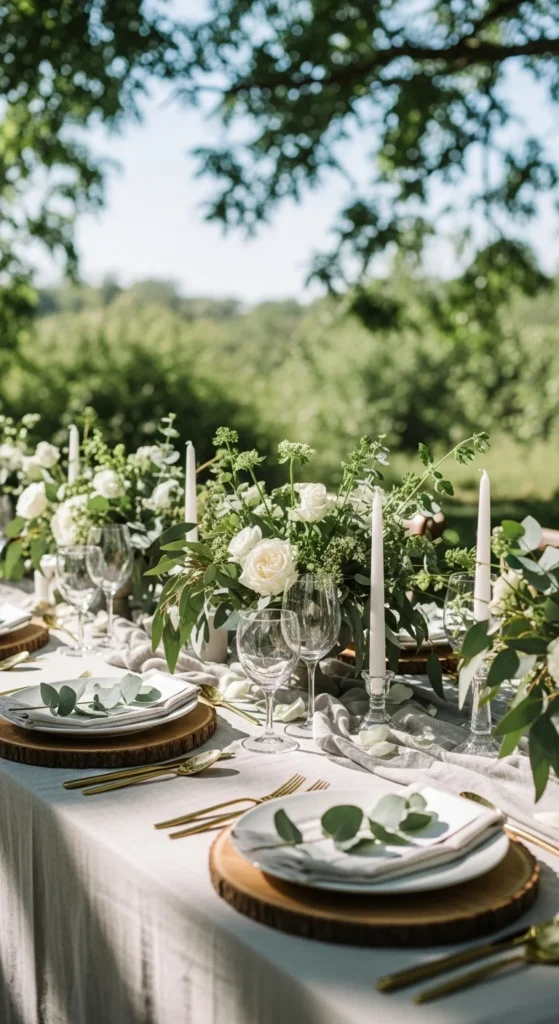
This palette feels organic. Eucalyptus green works through foliage. Linen tones soften everything. Skip dyed fabrics. Natural materials save money and photograph well.
13. Pale Blue and Silver
Pale blue reads calm. Silver adds light. Use silver through frames or flatware. Blue linens or attire keep the look balanced. Avoid dark blues, which can look heavy in photos.
14. Rose and Dove Gray
Rose feels deeper than blush but still soft. Dove gray grounds it. This palette works well for mixed indoor and outdoor spaces. Use rose in bouquets and stationery. Gray works well for suits and signage.
15. Peach and Ivory
Peach and ivory feel warm and flattering. Keep peach light. Use ivory as the base everywhere else. This palette photographs well at golden hour.
16. Soft Lilac and Cream
Lilac adds color without harsh contrast. Cream keeps it soft. Use lilac sparingly. Cream dresses and linens keep photos balanced.
17. Powder Blue and Taupe
Powder blue feels calm. Taupe keeps it neutral. This palette works well for rustic or classic venues. Use blue for attire. Taupe for décor bases.
18. Soft Green and White
This palette relies on greenery. White keeps it clean. Use potted plants instead of florals. White linens reflect light and simplify photos.
19. Blush, Ivory, and Gray
This trio feels balanced and timeless. Ivory softens everything. Blush adds warmth. Gray grounds the palette. Use each color with restraint. This approach keeps photos calm and cohesive.
Conclusion
Spring wedding photos benefit from colors that work with light instead of competing against it. Soft palettes help faces glow and spaces feel open. Choosing a clear color direction early makes décor, attire, and flowers easier to plan and easier to budget. Pick a palette that feels natural to you, repeat it in small ways, and let the season do the rest.